

For a long time, typography was treated as a merely functional tool. However, this paradigm has been increasingly deconstructed in recent decades. Today, the shape of letters is not just a means of reading — it has come to carry a symbolic weight as significant as the word itself. Experimental typography emerges precisely at this breaking point, where the purpose is not limited to legibility, but extends to the creation of meaning, atmosphere and emotion.
This movement gained momentum with thinkers and designers like Neville Brody, but today it resonates in the national market. In an internal Globo presentation , for example, the visual identity team highlighted:
“Typography has the power to move people even before the message is understood.”
This view reinforces the understanding that typographic design can be an immersive experience, capable of affecting the reader in a visceral way. As a result, typography ceases to be a simple graphic resource and begins to occupy a central place in contemporary visual communication.
The deconstruction of the grid and the rise of emotion
One of the hallmarks of experimental typography is its deliberate break with rigid visual structures. The use of symmetrical grids, formal alignments, and predictable typographic systems is often eschewed in favor of more intuitive, sensory, and even chaotic approaches. This is no accident: it is an aesthetic strategy that seeks to provoke, challenge, and capture attention in a world saturated with conventional visual stimuli.
Rico Lins, a Brazilian graphic design icon, summarizes this point in an impactful way:
“Typography is a voice. And dissenting voices need to exist.”
This dissonance is strategic. Breaking the pattern serves as a tool to create tension in the message and generate immediate impact, especially in cultural projects, activists, and brands that wish to position themselves as avant-garde. Thus, typography ceases to be neutral and becomes an active agent in constructing the brand's discourse.
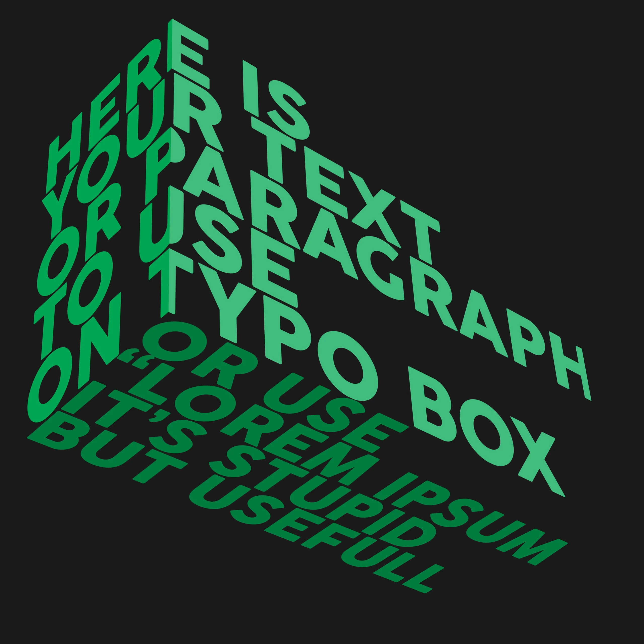
Furthermore, in a digital environment where attention spans are increasingly shorter, unpredictable visual forms directly contribute to increased visual retention and engagement.
Brands that dare grow: branding through disruption
Today, businesses that want to stand out need to create memorable experiences from the first visual contact. In this sense, experimental typography is consolidating itself as a strategic resource for differentiation. The application of unconventional letters, fragmented shapes and bold compositions conveys an identity that is unique, authentic and memorable — the opposite of generic corporate neutrality.

Natura , in launching campaigns such as "Live Your Beauty , Live," used organic and fluid typography to express diversity and identity in an emotional way. In a case study published at the Brazilian Graphic Design Biennial, the brand stated:
“The typographic choice was as important as the color palette or the script of the film. She was the voice of the concept.”
In other words, design that seeks to please everyone often touches no one. By adopting experimental typographic solutions, companies can better reflect their values, attract audiences aligned with their purpose and create deeper emotional connections.
Furthermore, neuromarketing studies indicate that purchasing decisions are guided more by emotion than by reason . This reinforces the relevance of visual approaches that go beyond logic and explore the sensory experience. When well applied, experimental typography acts as an accelerator of meaning and belonging, especially among younger generations of consumers.
When form inspires movement and attitude
Experimental typography is not just an aesthetic—it's a stance . By adopting unstable, fragmented, or "illegible" visuals, the design invites the reader to interact with the message more actively. This generates layers of interpretation that go beyond the textual content and enter the realm of the symbolic, the emotional, and even the political.
GloboNews , in redesigning its identity in 2021, opted for geometric fonts and typographic overlays as a symbol of multiple narratives. In an official statement, the branding team commented:
“Legibility gives way to expressiveness when we want to provoke reflection.”
This insight is a watershed moment for the contemporary understanding of design. True communication is not just about being quick and clear to read, but about the ability to awaken feelings, provoke reflection and leave a lasting impression. Experimental typography is therefore particularly effective in high-impact advertising, visual activism campaigns, disruptive editorial design and immersive digital interfaces.
Each choice of shape becomes a strategic gesture with a direct impact on the brand’s narrative.
Visual innovation in the Brazilian context
In Brazil, experimental typographic production has been gaining notoriety for its originality and connection to diverse social contexts. Designers such as Rico Lins, Rafael Dietzsch and the collectives Tupigrafia and Cripta Djanira have explored languages that combine references from popular culture, urban calligraphy, ancestry and social criticism. The result is a highly original visual repertoire that breaks with European and American standards, bringing new perspectives to global design.
Furthermore, many of these works have won international awards and been exhibited at events such as the ADG Graphic Design Biennial, consolidating Brazil as a fertile territory for visual experimentation with its own identity. Typography here is not just style — it is resistance, a collective voice and an instrument of innovation.
The future of typography as a business tool
Companies that want to stay relevant in the years to come will need to master not only the aesthetics, but also the semiotics behind each visual choice. More than that, it will be crucial to understand how these forms impact consumer perception across multiple channels. Experimental typography is no longer a niche reserved for alternative design — on the contrary, it is increasingly being incorporated by major companies in high-impact campaigns and bold rebrands.
Magazine Luiza , for example, adopted a more flexible and emotional typographic system for its digital presence as part of a brand humanization strategy. An internal branding report mentioned:
“The new typography doesn’t just communicate — it breathes. It smiles with the customer.”
Thus, form becomes a strategic layer of content—not just a functionless graphic adornment. As a result, by investing in unique visual experiences, brands can amplify their storytelling power, strengthen their positioning, and build deeper emotional connections with their audience. Consequently, in saturated and ultra-competitive markets, this visual approach can be the deciding factor between being remembered or completely ignored.
In short, typography is no longer a technical detail but a strategic asset. Brands that neglect this potential are opening the way for bolder competitors to occupy the consumer's imagination.
FAQ — Experimental Typography in Strategic Design
1. Experimental typography reduces readability. Is this a problem?
It depends on the context. In projects focused on visual impact, such as cultural campaigns, editorials or niche branding, the disruption of legibility is intentional. When used well, it creates more engagement and memorization of the message.
2. How to apply experimental typography without compromising brand identity?
The key is balance. Experimentation should reflect the brand’s values and be consistent with its tone of voice. One-off applications — such as seasonal campaigns or launches — are great spaces to innovate without losing consistency.
3. Is there a measurable ROI when using this type of typography?
Yes. Several campaigns that adopted experimental visual resources showed an increase in awareness, visual exposure time and engagement on social media. When applied strategically, experimental typography influences metrics such as recall and perceived value.
4. In which sectors does this approach have the most impact?
Fashion, technology, culture, entertainment, premium food and brands aimed at young audiences are the sectors that benefit the most. However, more traditional segments can also use it to reposition and rejuvenate their brands.